|
User Testing: Retooling an HR Intranet
The Problem
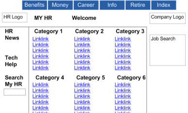
The site’s front page
tried to be a one-click shop by featuring many links to various features.
Although these were grouped under category headings, users tended to ignore
the headings and instead searched through the links one by one.This problem
was compounded since 40 to 60 links appeared on category pages. Users
ignored the subheadings and sequentially searched the links, often giving
up after reading through 10 or 15 items and failing to find the information
they wanted.
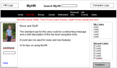
The Solution
Guide users to category headings rather than link items. When the mouse
moves over an item on the category bar, text appears below describing
the contents of the destination page. On category pages, headings are
subtly emphasized so they can be read at a glance. Category headings are
shaded and rendered in 14-point type, larger than the 11-point link items,
which themselves are large enough for older adults. Other changes were
also made, such as repositioning and resizing elements
markrichman@lycos.com |